
|
| Stream Monitoring | Guided Research Data Analysis |
|
Creating the Context Home Research Focus Background Info Research Methods Data Submission Results of Study Data Analysis Conclusion Further Research Guided Research Research Question Background Info Research Methods Data Submission Results of Study Data Analysis Conclusion Further Research Research Values Student Research Doing Research Publish View Tools Discussions Stream Teams Water Links
|
So, now that I have my data, what do I do with it?Visualizing DataGraphs are one way to visualize data and to help the researcher look for patterns. A graph is used to show the relationships of data collected from the experiment. Graphs must be constructed accurately and according to accepted rules. Usually, a graph shows the relationship between two kinds of data. These data are called variables. In this research the variables are location on the stream, headwaters or mouth, and the Water Quality Index. These are two types of variables. The independent variable is data that influences the outcome of the experiment. Often the experimenter has control over this variable, in this case by choosing the location of your sample. Time is also very common independent variable. This data is plotted in the horizontal axis, x axis. In our research we are going to explore the relationship between location on the stream and the Water Quality Index. Location on the stream is our independent variable. The dependent variable depends on the conditions of the investigation, and frequently on the independent variable. The dependent variable is sometimes referred to as the outcome variable. The dependent data is plotted on the vertical axis, the y axis. In our research on the stream the Water Quality Index is our dependent variable. Remember when you make graphs:
Spreadsheets will offer you a graphing options for your data but it is very important that you understand the graph you have made and that the graph accurately represents your data. Construct a bar graph of the data you have downloaded.
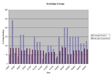 In this case, bar graphs are interesting and a good way to visualize data because we are making a simple comparison. We do not have enough data points on this research to really explore the relationship between location and WQI. The following is an example of a line graph that could be made with multiple data points along the same stream, taken at the same time! Line graphs show the relationship between two kinds of data in which the independent variable is continuos. After the proper points are plotted on the graph, they should be connected by a line. To learn more about graphing and how to make various kinds of graphs, the DIGSTATS site should be helpful. 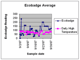
Making a Box Plot John Tukey has developed which gives greater prominence to the dispersion, the spread of the data. This method is known as a boxplot, or a box-and-whisker plot. To learn how to construct a boxplot. Like a line graph, a boxplot requires many data points. The following is an example of a boxplot using the same data represented in the line graph. To do this kind of analysis you would have to restructure your research or ask a new question! 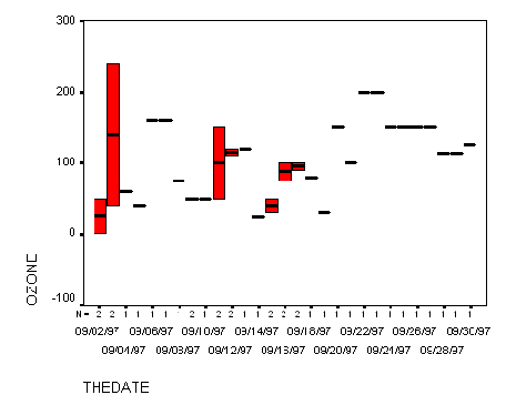 Hypothesis Testing This research was set up with two hypotheses. The null hypothesis, H0, states that events will not change, not differ and alternative hypothesis, H1, states that events will differ from some baseline standard or control conditions. This change (dependent variable) predicted by H1 will be due to the occurrence of an experimentally controlled variable (independent variable).
H0: There is no measurable change between the the WQI at the headwaters of a stream and the WQI at the mouth of a stream. H1: There is a measurable change between the the WQI at the headwaters of a stream and the WQI at the mouth of a stream. Actual hypothesis testing consists of several stages:
Using Geographic Information Systems for Analysis> A geographic information system (GIS) is a computer-based tool for mapping and analyzing things that exist and events that happen on earth. The data that we have collected as a part of this project is well suited to GIS technology because it has a critical geographic dimension. GIS integrates common database operations such as query and statistical analysis with the unique visualization and geographic analysis benefits offered by maps. These abilities distinguish GIS from other types of analysis.
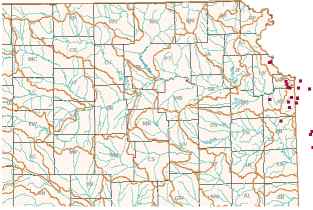 Mapmaking and geographic analysis are not new, but a GIS performs these tasks better and faster than do the old manual methods. And, before GIS technology, only a few people had the skills necessary to use geographic information to help with decision making and problem solving. A GIS stores information about the world as a collection of thematic layers that can be linked together by geography. This simple but extremely powerful and versatile many real-world problems from tracking delivery vehicles, to recording details of planning applications, to modeling global atmospheric circulation. Links to using GIS to analyze your stream data are in the Data Analysis section, to see the watersheds in Kansas click on the link Kansas Watersheds I would like to work with the Kansas data in a map-based format.
|
| © 1996-2006 PathFinder Science |